Quick and Easy. React Component to show a modal dialog with react-bootstrap. Alternative of window.confirm, window.alert, and window.prompt.
Overview
React Bootstrap Dialog is a powerful component library designed to enhance user interaction within React applications by providing an elegant alternative to traditional alert, confirm, and prompt dialogues. Built on the sturdy foundation of react-bootstrap’s <Modal />, this library allows developers to seamlessly integrate customizable alert and dialog functionalities without compromising on design or performance.
This library is noted for its ease of use and configurability, making it a suitable choice for developers working with React Bootstrap versions 3 and 4. With the React Bootstrap Dialog, managing user confirmations, prompts, and alerts becomes smoother and more aesthetically pleasing, ensuring a better user experience across your applications.
Features
- Easy Integration: Just import the package and incorporate it into your JSX code with minimal setup.
- Customizable Dialogs: Tailor the appearance and behavior of dialogs by setting default options for buttons and sizes, ensuring a consistent UI.
- Multiple Dialog Types: Supports various dialog types including alerts, confirmations, and prompts, catering to a range of user interaction needs.
- Responsive Design: Compatible with versions 3 and 4 of react-bootstrap, allowing for flexibility in design frameworks while maintaining responsiveness.
- Action Generators: Create custom button actions with ease by defining labels and functionalities within the dialog, enhancing user engagement.
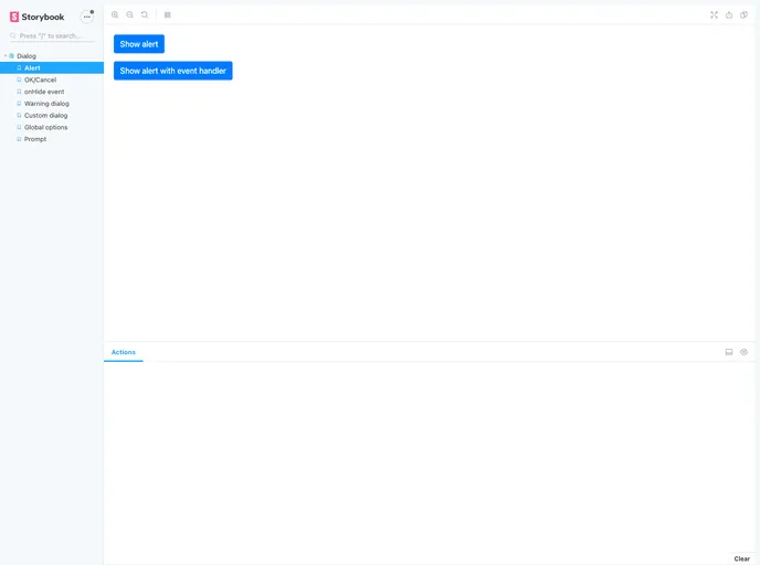
- Simplicity: Offers straightforward methods like
showAlert and show, which mimic native window functions, making it easy for developers to transition to this library. - Versatile Sizing Options: Provides choices for dialog sizes, ensuring they fit well within the application’s layout—options include small, medium, and large configurations.
- Close Handling: Allows developers to define actions on dialog closures, adding an extra layer of interactivity and control.