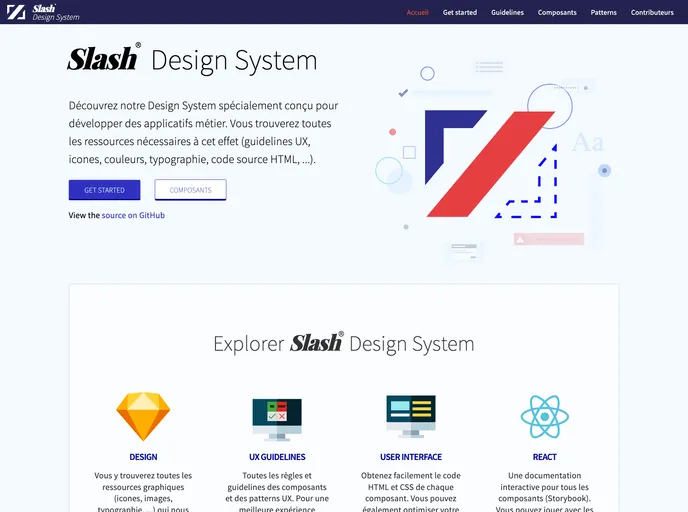
Flexible components html + css + react using BEM convention. Maybe, you can call it "Design System" !
Overview
The @axa-fr/react-toolkit is a versatile library designed for building React applications using a set of independent components. It is built on HTML and CSS, employing the BEM (Block Element Modifier) convention, which ensures that each component is not only self-contained but also easy to extend. Whether you’re starting a new app from scratch or integrating components into an existing project, this toolkit offers a pragmatic approach to component design that simplifies development.
What sets this toolkit apart is its simplicity. With components that can be easily dragged and dropped into your application and customized using CSS modifiers, developers can create visually appealing interfaces without heavy configurations or dependencies. This makes it an appealing choice for both novice and seasoned developers looking for an efficient way to manage their UI components.
Features
- Autonomous Components: Each component is independent, allowing developers to pick and choose what they need without overload.
- BEM CSS Convention: Utilizes the BEM methodology for CSS isolation, making styles easy to manage and reducing conflicts.
- Easy Integration: Build apps from scratch or seamlessly integrate with existing applications, offering great flexibility.
- Customizable: Simple to modify with CSS modifiers that allow for personal styling to fit your application’s needs.
- Tree Shaking: Use tree shaking to reduce your bundle size by only installing the components you require.
- Comprehensive Documentation: Well-structured documentation exists to guide developers through acquisition and installation procedures.
- Wide Range of Components: The toolkit includes various components like buttons, forms, alerts, and more, catering to diverse needs.
- React Storybook Support: Provides a dedicated website for exploring components and their usage, enhancing the development experience.