A simple circle progress component created for Angular based on SVG Graphics.
Overview
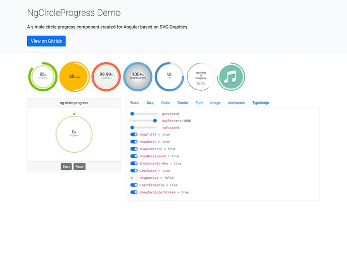
The ng-circle-progress is a versatile and visually appealing component designed specifically for Angular applications. Utilizing SVG graphics ensures high-quality rendering across different devices, making it an excellent choice for developers looking to enhance their application interfaces with circle progress indicators. This component simplifies the progress visualization process while providing a variety of customization options to suit different design preferences.
Whether you are building a dashboard, a loading indicator, or any other application that requires displaying progress in a circular format, ng-circle-progress offers a straightforward solution. Its ease of use combined with the ability to integrate seamlessly into Angular applications makes it a valuable tool for both novice and experienced developers.
Features
- SVG Graphics: Leverages SVG to create smooth and high-resolution circle progress indicators, ensuring crisp visuals on all devices.
- Customizable Styles: Offers a range of customization options including colors, stroke width, and more to match your application’s design.
- Easy Installation: Simple installation process via Angular CLI, allowing you to integrate the component into your project with minimal effort.
- Responsive Design: Automatically adjusts the size and scales the progress indicator according to the parent container’s dimensions.
- Built-in Animations: Comes with built-in animations that enhance the visual experience when displaying progress changes.
- Support for Multiple Types: Capable of displaying various types of progress including static, dynamic, and percentage-based.
- Documentation and Demo: Comprehensive installation guide and demo available to help users quickly understand how to implement the component effectively.