Overview
The DateRangePicker is a powerful Angular library designed to provide users with a robust and seamless date range selection experience. With compatibility for various versions of Angular and ng-bootstrap, this library ensures that developers can integrate it into their projects without hassle. Whether you’re building a simple application or an advanced web interface, the DateRangePicker stands out for its flexibility and ease of use.
This library has evolved through several versions, each improving its compatibility and functionality. The standalone components make it easier to manage and implement, accommodating various needs in date handling while adhering to the latest Angular practices.
Features
- Compatibility: Works with Angular versions from 10 to 21 and ng-bootstrap versions from 7 to 20, ensuring broad usability across different projects.
- Standalone Components: Easy integration and management of date selection components, allowing developers to use them independently within their applications.
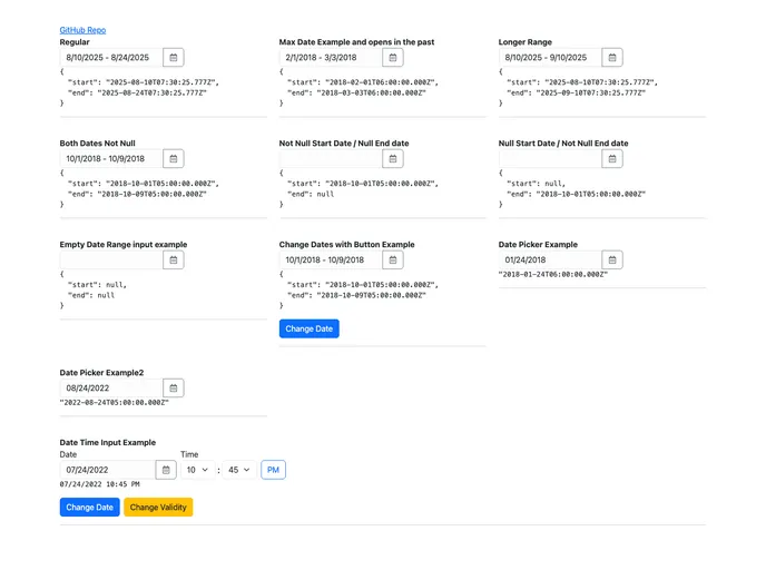
- Date Range Model: Provides a straightforward object representation of date ranges, inclusive of both start and end dates, making it easy to handle user-selected periods.
- Wrapper for ng-bootstrap: Utilizes ng-bootstrap’s existing date picker capabilities, enhancing functionality without reinventing the wheel.
- Updated Functionality: Each version update improves compatibility with the latest Angular and ng-bootstrap releases, ensuring that developers can leverage new features and optimizations.
- User-friendly Interface: Intuitive design for users to select date ranges effortlessly, making it suitable for various applications from simple to complex use cases.
- Quick Demo Access: Features a demo that showcases the date range picker, helping developers understand its functionality before integration.