A rating react component with custom symbols.
The React Rating component is a versatile tool designed to enhance user interaction by enabling easy and customizable rating systems. Built with the React library, this component allows for seamless integration into any React application. Inspired by the jQuery plugin bootstrap-rating, React Rating supports various symbols, including custom icons drawn from popular CSS frameworks like Fontawesome and Bootstrap, making it a stylish addition to your project.
This component is designed for flexibility and ease of use, offering a range of configuration options that cater to different application needs. Whether you’re looking to implement a simple star rating or a more complex rating system with custom symbols, React Rating has the features to meet those requirements effectively.
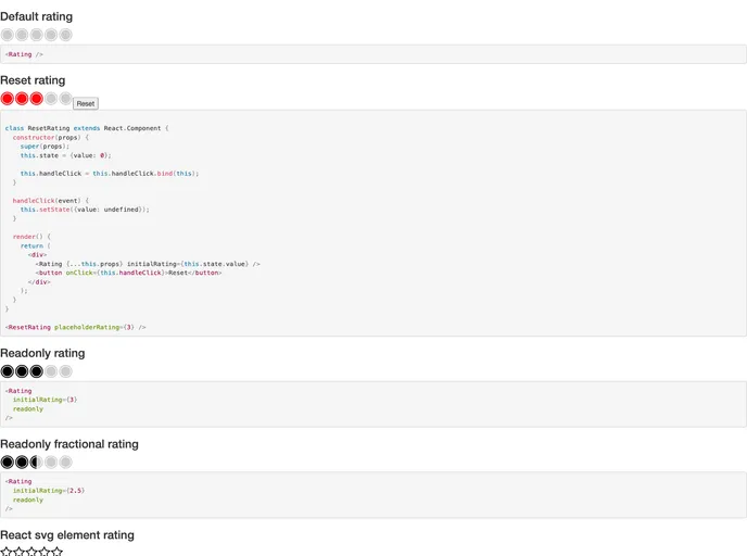
Custom Symbols: Supports both inline styles and glyphicons from CSS Toolkits, allowing for complete aesthetic control.
Range Configuration: Define start and stop values for the rating scale, letting you customize the rating range for your specific needs.
Step Functionality: Set how many values each symbol represents, giving you fine control over the granularity of ratings.
Fractional Ratings: Allows users to select ratings with precision down to half a symbol, enhancing rating accuracy.
Initial & Placeholder Ratings: Easily set default ratings with options for initial and placeholder values to improve user experience.
Read-Only Mode: You can toggle the read-only state to prevent modifications, making it ideal for display purposes.
Directionality: Supports both left-to-right (ltr) and right-to-left (rtl) orientations, accommodating various language requirements.
Styling Options: Customize the appearance of empty symbols using React elements, inline styles, or CSS classes for improved visual feedback.