Get started with building your own React library using Rollup.js and Storybook with this starter kit
Creating a custom React library is an exciting venture for developers looking to streamline their workflow by sharing reusable components and functionalities across various projects. The React Library Builder offers a comprehensive solution that simplifies the process of building and publishing your own library. Through a well-structured approach, this guide covers everything from initial setup to deployment, ensuring that your components are not only functional but also easily accessible for other developers.
By following the steps provided, you can effectively develop your components, style them, ensure quality through testing, and even publish your library to NPM. Whether you’re working on a personal project or collaborating within a team, having a custom React library can significantly enhance productivity and maintainability in your codebase.
Easy Setup: Quickly create a new directory and clone the React Library Builder repository to kickstart your project without hassle.
Component Development: Effortlessly build reusable components by adding new files in the src/components folder and update the index file for easy imports.
Styling Support: Utilize both SCSS and CSS for styling your components, with guidance on using CSS modules if desired.
Testing Framework: Ensure your components work as intended using Vitest and @testing-library/react, with example test files provided for reference.
Linting Tools: Maintain code quality with ESLint and eslint-config-prettier, allowing customization of linting rules as per your project’s needs.
Publish to NPM: Share your library with the world by publishing it to NPM, with straightforward instructions for setting up your account and configurations.
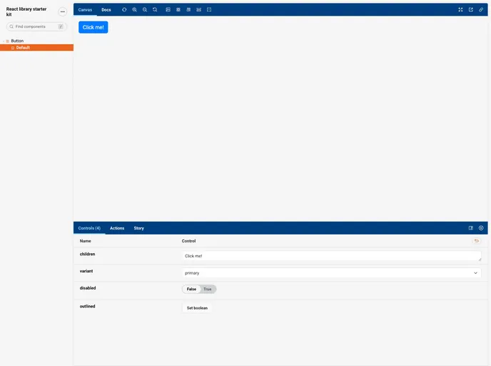
Storybook Integration: Create a Storybook for visual testing and deploy it to GitHub Pages for easy access, showcasing your components to others effectively.