Angular component for ISO_8601 durations
The ngx-duration-picker is a highly versatile Angular component designed for selecting durations in a user-friendly manner. Built to comply with ISO 8601 standards, this component is perfect for developers looking to implement a duration picker without the overhead of Bootstrap JavaScript or jQuery. Its seamless integration into Angular applications allows for quick setup and flexibility, making it an essential tool for efficient time management in apps where duration input is critical.
What sets ngx-duration-picker apart is its rich set of customization options. Not only can developers easily style their components with Bootstrap CSS, but they also have full control over how users input and visualize durations. With its intuitive features, this component can enhance user experience, whether it be in forms, scheduling applications, or any other scenarios requiring duration input.
Easy Installation: Simply run npm install --save ngx-duration-picker and add DurationPickerModule to your Angular module imports.
Reactive Value Binding: Bind the duration with a variable using [(value)] to store the output, enabling immediate reflection of changes in your application logic.
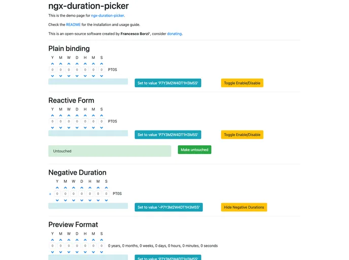
Customizable Options: Take advantage of various options to tailor the picker to your needs, including the ability to show or hide weeks, buttons, and more.
Flexible Output Formats: Define how the output should appear with options for timestamp, seconds, or a custom string format.
Live Preview: Users can visualize the selected duration in real-time, providing clarity as they make adjustments.
Dynamic Labels: Adjust the displayed units (like years, months, days) by customizing labels, enhancing user friendliness.
Step Size Control: Fine-tune the increment or decrement step size for each unit, allowing nuanced duration selections suited to your use case.
Support for Negative Durations: With an option to display both positive and negative durations, this component caters to a wider range of applications.
These features contribute to a robust, user-centered design that enhances the experience of handling duration inputs in Angular applications.