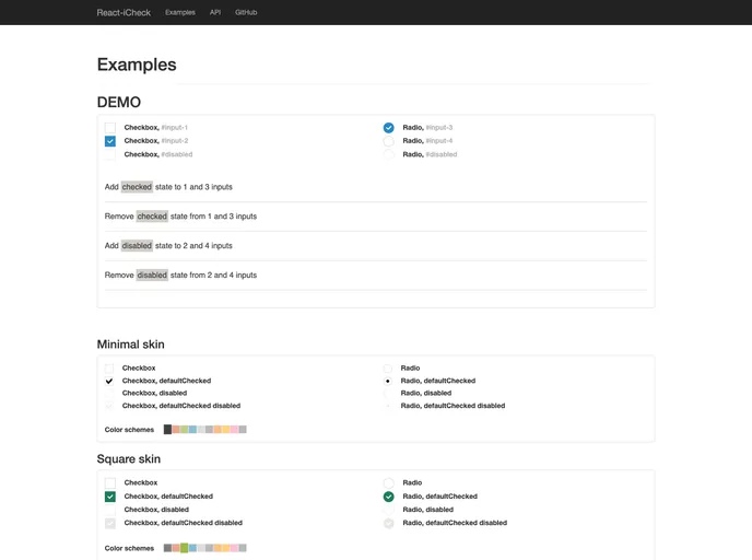
:radio_button: iCheck components built with React. Highly customizable checkbox, radio buttons and radio group.
Overview
React-iCheck offers a modern approach to form elements in web applications, integrating seamlessly with React while leaving behind the constraints of jQuery and Zepto. This library is designed to provide a consistent, visually appealing user experience across all devices and browsers, making it an attractive option for developers seeking to enhance their input components without the overhead of additional libraries.
As it stands, React-iCheck is still in development but promises to deliver a rich set of features aimed at improving accessibility and customization. Whether you’re targeting desktop or mobile users, this library aims to meet their needs with a focus on both functionality and style.
Features
- Cross-Browser Compatibility: Ensures identical inputs across all major browsers including Internet Explorer, Firefox, Chrome, and Safari.
- Mobile Friendly: Optimized for touch devices such as iOS, Android, and Windows Phone, ensuring a smooth experience regardless of platform.
- Keyboard Accessibility: Inputs are fully operable via keyboard shortcuts, enhancing usability for all users.
- Customizable Design: Offers complete freedom to style inputs using HTML and CSS, with several retina-ready skins available for a modern look.
- No jQuery Required: Built entirely with React, eliminating the need for jQuery or Zepto, thus reducing dependencies.
- Screen Reader Support: Includes ARIA attributes that make inputs accessible for users who rely on screen readers, improving inclusivity.
- Lightweight Library: Minimal size ensures quick loading times without sacrificing functionality.
- Active Development: Continuous updates and community contribution keep the library evolving to meet developers’ needs.
