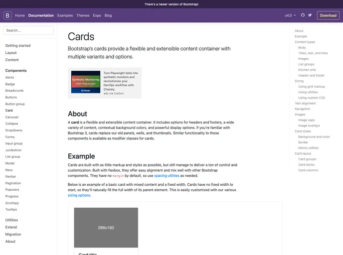
Bootstrap 3 Card screenshot

Bootstrap 3 Card

Author Avatar Theme by Martinbean
Updated: 29 Oct 2018
82 Stars

Bootstrap 4 card component, back-ported for Bootstrap 3.

Categories

Overview

The Card component for Bootstrap 3 is a thoughtfully designed package that mimics the visual style of Bootstrap 4 cards, tailored specifically for projects still utilizing Bootstrap 3. By keeping with the Sass version, it allows developers to incorporate a modern look and feel into their web applications without sacrificing compatibility. While it excels in aesthetics, it’s important to note that this package does not incorporate Flexbox functionality, ensuring that it remains faithful to Bootstrap 3’s original framework.

Given that this component was created to enhance Bootstrap 3 with the updated appearance of cards, it is not actively maintained, meaning no additional features or improvements are planned. Developers looking to leverage this design can easily fork the repository to expand upon its capabilities if desired.

Features

  • Modern Aesthetic: Brings the current card design from Bootstrap 4 to the Bootstrap 3 framework, elevating the visual quality of your project.
  • Sass Compatibility: Designed specifically for Sass-based projects, allowing for easy integration and customization.
  • No Flexbox Dependency: Maintains the original Bootstrap 3 grid system’s integrity by avoiding any Flexbox features.
  • Easy Installation: Can be easily imported using npm or Bower, making setup straightforward for developers familiar with these package managers.
  • MIT License: Open-source licensing allows usage and modifications without barrier, fostering community development and innovation.
  • Forkable: Developers are encouraged to fork the repository to add new functionalities, allowing for community-driven enhancements and adaptations.