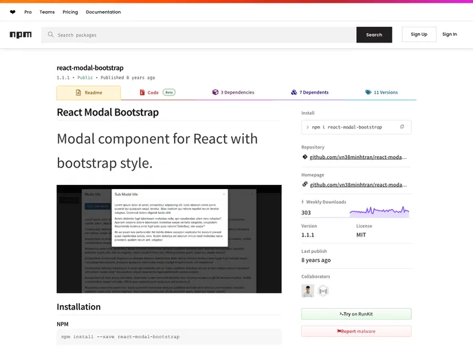
Modal component for React with bootstrap style.
If you’re looking to incorporate a modal into your React application while maintaining a cohesive look with Bootstrap styles, the React Modal Bootstrap component is a stellar choice. Designed to seamlessly integrate with React, it provides a user-friendly interface and a variety of customizable options that can enhance user engagement on your website or application.
This component comes equipped with essential features that allow for a versatile modal experience, making it suitable for various use cases, from simple alerts to complex form submissions. Below, we’ll explore some of its standout features that make it a go-to solution for developers.
backDropStyles and dialogStyles props, creating a unique appearance that fits your aesthetic.backdrop prop allows the modal to close when the backdrop is clicked, enhancing the user experience by providing an intuitive way to dismiss the modal.keyboard prop, users can close the modal by pressing the ESC key, making it more accessible for keyboard users.onRequestHide function to execute actions when the modal requests to be hidden, allowing for more dynamic interactions.