Overview
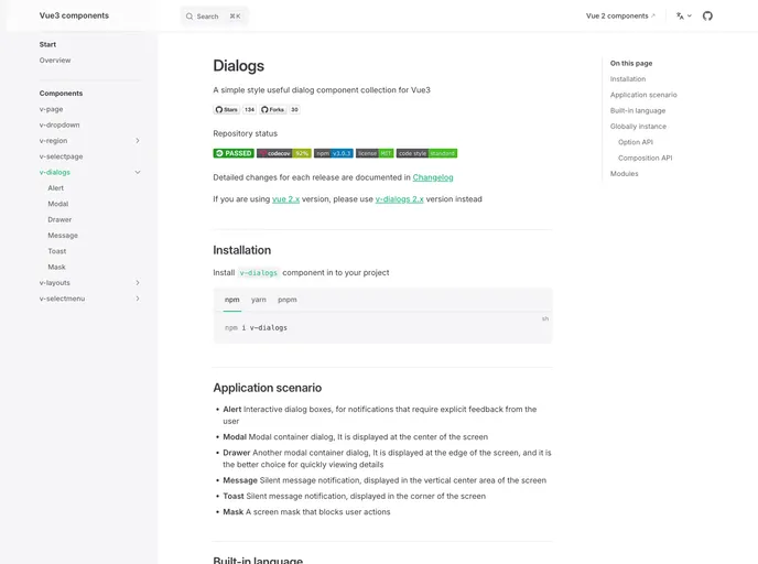
v-dialogs is a versatile and user-friendly dialog component collection specifically designed for Vue 3. It provides a range of interactive options to enhance user engagement and feedback in web applications. Whether you’re creating alert boxes, modal windows, or silent notifications, v-dialogs offers a straightforward implementation that seamlessly fits into your UI, ensuring a polished look and feel.
This collection features six different types of dialogs, making it suitable for various scenarios—from simple notifications to detailed information displays. With built-in multilingual support and both option and composition APIs, v-dialogs is a powerful tool for developers looking to create an engaging user experience.
Features
- Multiple Dialog Types: v-dialogs provides six different dialog types including Modal, Drawer, Alert, Message, Mask, and Toast to suit various interaction needs.
- Simple Style: The straightforward design makes it easy to integrate into existing UI without extensive styling adjustments.
- Functional Component Forms: Modal and Drawer dialogs are provided as component forms (DialogModalBox and DialogDrawerBox) for more flexibility in usage.
- Quick Access Function: Alert, Message, and Toast types allow for quick message notifications, streamlining communication with users.
- Built-in Language Support: The library supports four languages: Chinese, English, Japanese, and Portuguese, catering to a global audience.
- Global Instance: A globally accessible instance ($dlg) allows dialogs to be opened from any component, though it’s recommended to use this feature judiciously.
- Option and Composition API Compatibility: v-dialogs is compatible with both the Option API and the Composition API, making it adaptable for different coding styles.